Tuesday, 30 November 2010

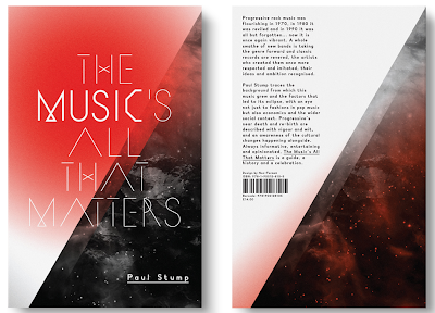
http://www.non-format.com/


I love these guys! Talk about total graphics and a splash of constant freshness.

http://www.non-format.com/

"Kjell Ekhorn (Norwegian)
and Jon Forss (British) have
worked together as the
creative direction & design
team Non-Format since 2000.
They work on a range of
projects including art direction,
design, illustration and custom
typography for arts & culture,
music industry, fashion and
advertising clients. They have
art directed the independent
music monthly The Wire and
also Varoom: the journal of
illustration and made images.
A bestselling hardback
monograph entitled
Non-Format Love Song was
published by Die Gestalten
Verlag in 2007. A second edition
was published in Spring 2008.
A Non-Format edition of
Pyramyd’s Design And Designers
series was published in 2006.
Non-Format is based in Oslo,
Norway and Minneapolis, USA
–"

5 of the Best New User Experiences of 2010

http://mashable.com/2010/11/28/best-ux-ui/

I saw this on a friends posting on Face Book and is a useful reference for ui thinking and approach.

If I can highlight two products.

This is a great new website / product offering that makes finding a flight much easier. I love the fact that that they have re-approached this area. This strikes me once again that design is simply a subject of questions and answers and the better the designer the better his or shes ability to ask different and better questions about the same old problems. This ability divides us from them.

Also, I love that the designer focuses on quality of product at the end of the interview. If you are looking for a string to tie a design team together this is a good one!


This is a Flip board app and I believe is just the tip of a much bigger iceberg. I love the way this product is a symbol of the customisable culture that apple struck upon with the app store and iPhone.

Channel 4 spots - Rudd Studio

"There are few greater challenges in brand design than taking an iconic, well-loved, universally recognised brand... and making it better. Channel 4 approached us with this task. It was to be a thorough revamp, across the entire channel and in its corporate activities. We took the essence of the ‘4’ and reworked it to allow for a more flexible, more fluid branding. We used the contrast between the ‘filled’ and ‘unfilled’ spaces in the four to give it depth and greater narrative capacity."
~ Rudd Studio

Some of Adeles new work

Some of Adeles new work, stunning voice great direction. New Albums out in the new year.

Ads


Thursday, 25 November 2010

SuperStupidBros - Stunning artwork


SuperStupidBros is a small Berlin- based design studio. The business, set up by two brothers, works exclusively with close friends and designers. Like in a band, there are no employees but rather members, who know each others flaws and flavors. Work should be fun and most of all work has to rock.

Beam Interactive in Boston


http://www.beamland.com/

This is the company that Tom (last post) works at. I love the work!

Here is a link to one of the projects that court my eye. Smart use of a native that enables users of iphone to swap contact details. Nice one! http://www.clinkclinkapp.com/

Tom Kershaw - Senior art director at Beam Interactive


http://tomkershaw.net

Some very nice work by a designer called Tom Kershaw.

Tom is currently senior art director at Beam Interactive in Boston.

Thanks for sharing your work with us.

Tuesday, 23 November 2010

Stunning example of art in architural space.


Reference found: http://designchapel.com/blog/2010/11/13/wallpaper-2/
Stunning example of art in architural space.


"Kenny Lindström’s and my wallpaper is finally on place at North Kingdom’s kitchen in Stockholm. I named the work “En kopp kaffe” which means a cup of coffee in Swedish. We also added a couple of lines to the illustration to make it more as a part of a story;

Her coffee smelt nice, but it felt like somebody was watching her. Even if the morning was chilly, she didn’t understand why her coffee had a touch of salt.

Like a deep lake of oil, her drink now took on a new dimension. The other side of the kingdom was now presented."


North Kingdom

In the world of cinematic web experiences their is one company that stands tall what ever the season: http://www.northkingdom.com/ Its worth taking the time and looking though the companies stunning portfolio!

Monday, 22 November 2010

Highly original ideas by VCCP


http://www.vccp.com/

Highly original, create and fun ideas by VCCP that you always remember.

I love the way that the ideas, as good as they are do not seem to overtake the brands.

Tuesday, 16 November 2010

Ray Ban Rare Prints


Ray-Ban introduce Rare Prints, a collection of colorful new patterns. To launch these new Rare Prints, Ray Ban collaborated with some artists to design posters inspired by each of the different patterns. What resulted is a unique set of limited edition posters, signed and numbered by the artists. Artists include: Vahalla Studios, Eric Van Den Boom, Marta Cerda Alimbau, Andreas Krapf, David Sossela and more (http://www.ray-ban.com/uk)!


Good friends keep their charm

http://you-reablog.blogspot.com/2010/11/lo-fi-sunday-im-believer.html

Watched this video this evening created by two old friends and took me back a few years. It is absolutely fantastic that some people stay the same and keep their wonderful charm! Great to see you again ladies x


UFFIE - DIFFICULT DIRECTED BY AB/CD/CD

Cool music video! UFFIE - DIFFICULT DIRECTED BY AB/CD/CD

Friday, 12 November 2010

Get your energy back’ 3D projection mapping for Toyota


The ‘Get your energy back’ 3D projection mapping for Toyota, delivers one of those ‘can that really happen?’ moments. But for something so focused on cutting-edge technology, I was surprised by how human it felt. From the initial beam of light, as the car comes to life, through to how it interacts with the environment gives the product real personality.

When using the latest technology to bring ideas to life, you always run the risk of the work feeling like a gimmick. This isn’t. It doesn’t use technology for the sake of it. The execution really delivers the proposition and makes you feel this car is something special.

Impressively, the idea works not only as a live experience, but also as a video. The way it blurs the line between fantasy and reality (look out for the fascinated toddler) not only merits a second viewing, but also makes you want to share it with others.

The ‘behind the scenes’ video is just a fascinating - giving you access to the sheer level of detail that makes it work so well (from all angles). The idea has clearly been cared for throughout the creative process. And this is what turns a good idea into a great one.

Tuesday, 9 November 2010

fat-man-collective


http://www.fat-man-collective.com/hello.php#brands

These guys do lovely websites!

Smart!

Creep (Radiohead) - Scala & Kolacny Brothers from Alex Heller on Vimeo.


Raphael Saadiq "Let's take a walk"

RAPHAEL SAADIQ "Let's Take A Walk" from Paranoid US on Vimeo.


Raphael Saadiq
"Let's take a walk"

CREDIT LIST
Client: Sony Music
Commissioner: Sara Greene
Director & Editor: Edouard Salier
Production Company: Paranoid US
Executive Producers: Cathleen O’Conor, Claude Letessier
Line Producer: Guillaume Raffi
Director of Photography: Stephane Vallée
Choreographer: Fatima Robinson
Assistant Choreographer: Joylene Frazer
Visual Effects Company: Digital District
Visual Effects Lead Artists: Xavier Reye, Damien Martin, Julien Michel, Fabien Vantroys, Florent Gombeaud
Traditional Animation: Corentin Rouge
Visual Effects Artists: David Sapyyapy, Jeremy Pierre, Thomas Boda, Da Hae Kim, Tyler Diamond
Flame Artist: Christophe Richard
Flame Assistant: Amandine Moulinet
Post Producer: Peggy Tavenne
Post Coordinator: Benjamin Bridet

paranoidus.com
facebook.com/​paranoidus

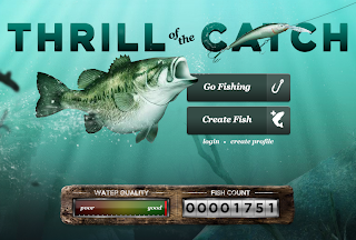
Lets go fishing!


http://discoverylake.discoveryeducation.com/

This is a great new site created by Red Interactive Agency: http://ff0000.com/

The Mill has a new site!


The Mill has a new site!

Monday, 8 November 2010

Jonathan Hoefler and Tobias Frere-Jones typefaces


http://www.typography.com/

Since 1989, Jonathan Hoefler and Tobias Frere-Jones have helped some of the world's foremost publications, corporations, and institutions develop their unique voice through typography. Their body of work includes some of the world's most famous designs, typefaces marked by both high performance and high style.

In 2004, The Hoefler Type Foundry entered its sixteenth year as Hoefler & Frere-Jones. H&FJ continues to work with brand leaders in every sector, developing original typefaces and licensing fonts from its library of more than a thousand designs, and it publishes fonts exclusively through its New York sales office and its web site at typography.com.